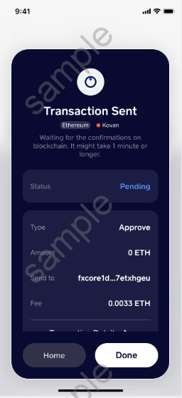
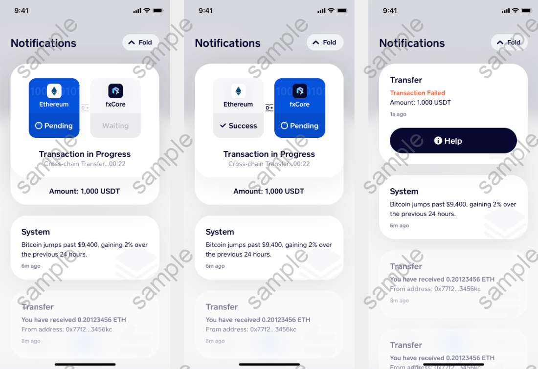
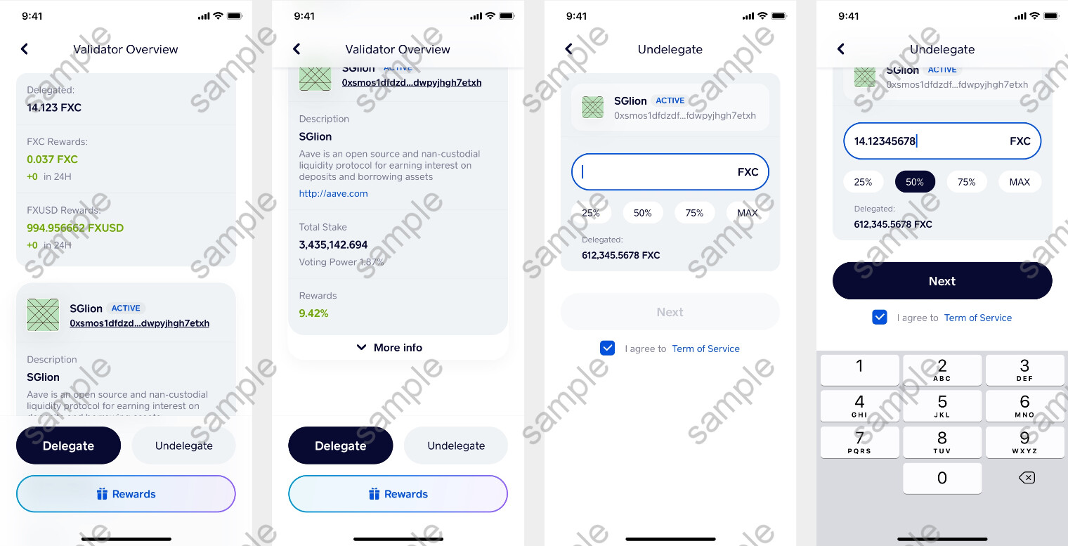
This looks amazing. I like that now it shows status of Pending.
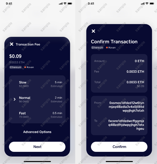
In the current version, there were lots of fail and retries transactions because after we click confirm or stake, we have no way to see what is going on unless you go onto the etherscan and check.
But there are a lot of beginners who thought that it didn’t go through so they keep retry and retry, flooding the eth traffic.
I really like this update, when it shows “Status”, people will know to wait and not keep re-do.
I can’t wait to stake the rest of my FX once main net goes live. A chunk is sitting on Kucoin waiting… to be staked.
Great job. Looks like some good stuff.
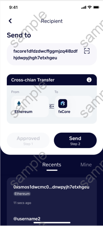
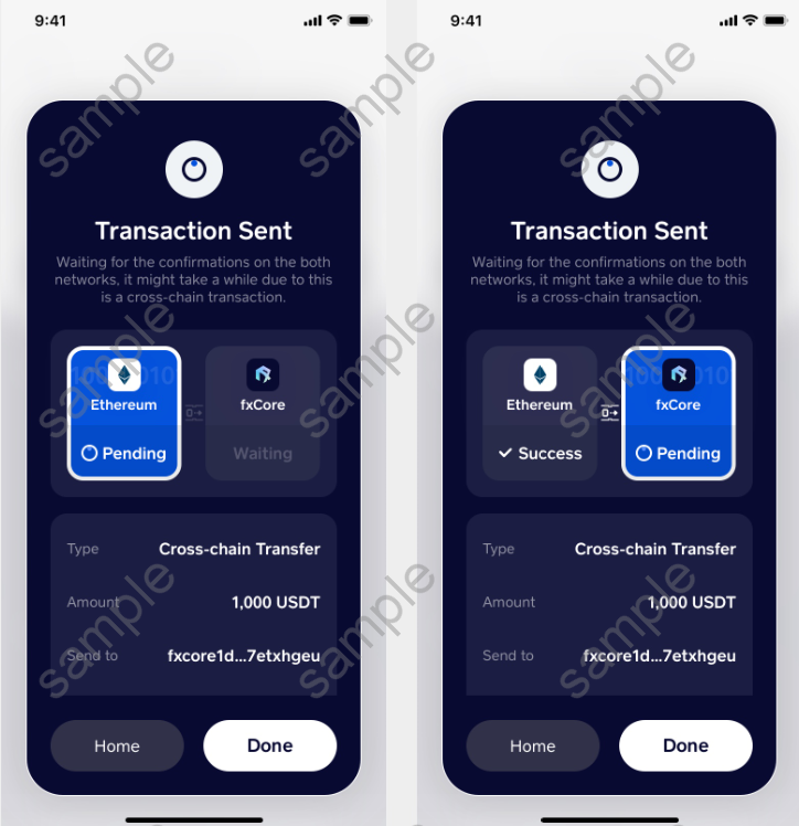
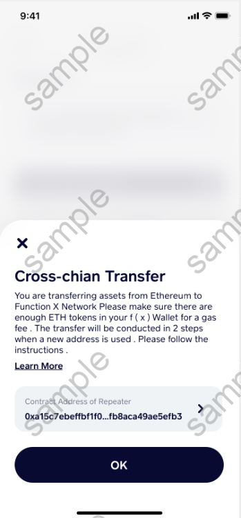
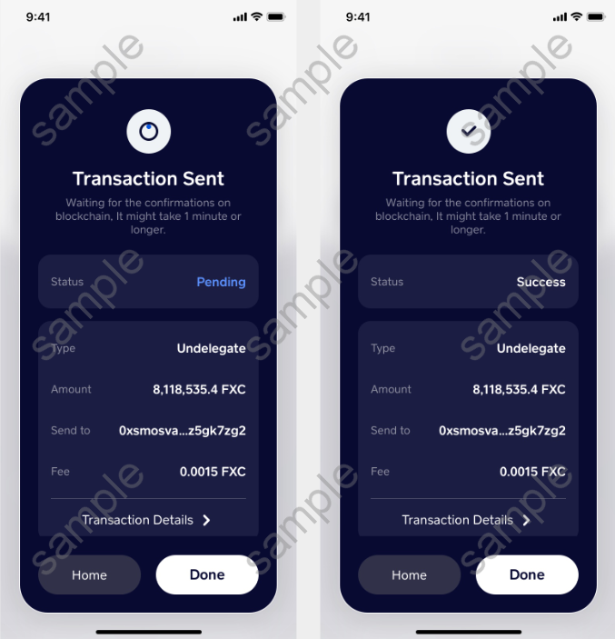
However, watch out for “cross-chIAn transfer” unless it’s on purpose and using IA.
Also, ORANGE for failure would be better as RED, but GREEN for success would be good as well.
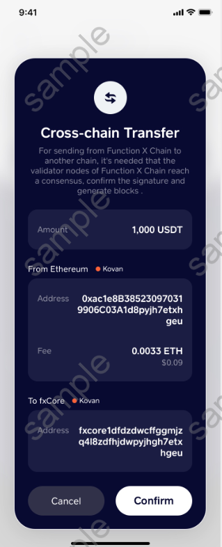
Also, an address book (FXCore, Ethereum, etc.) would be great so that the app shows the beginning and end of the real address as well as the “name” of the person you send tokens to.
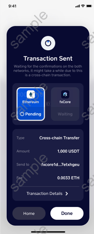
Eventually, there should be an INFORMATION icon (!) when there are 2 steps processes, so that a popup would explain what those 2 steps imply.
Thanks for this find, since the photos above are just some mock-ups of our beta software, functionality is the top goal we wish to achieve. The app will be going through some QA processes to get rid of all small UI / text bugs.
As for your suggestions, we appreciate them and will be taking everything under consideration.
Thx back. I think the team could also make good use of some UX design consulting to avoid the previous issues with users which happened during the swap.